(Disclaimer: This house will be completed in phases so not all spaces are “fully complete”. These photos are from the first phase which included full renovation and some furniture/accessories. Stay tuned for the second phase which will be fully accessorized and professional photographed!)
(Click here to check out this project page in our portfolio)

See how we took a poorly renovated 70’s ranch and turned it into an updated home fit for 5.
Before we get into the tour, I want to give you a little backstory of this project. When we first looked at this project, I was told it was hard to get a contractor and designer to sign on for a couple different reasons. The main reason being budget; I was definitely interested for the challenge. The few contractors and designers who looked into the project said it just couldn’t be done for the price and would need probably an extra $100k to get the results the client wanted. There were also issues with re-plumbing to get the Owner’s Bath relocated and how to make the house feel cohesive after the previous owner’s poorly planned additions onto the house. With smart planning, those were easy to tackle.
When I first came on site for the free in-home consultation and after understanding the client’s style, I immediately saw the true potential of the home. Despite the awkward additions and tight budget, I knew there were ways to work around these and use the spread out floor plan to our advantage. Since we were brought in before any concrete plans were made, we were able to plan for everything upfront and create a full cohesive game plan. This helped with understanding the budget and where we could go with it.
Of course, I was realistic with the client that we would be probably over budget for what she wanted but that it could be a fraction of what others were quoting. With my previous professional experience in model homes and renovations, I knew there were plenty of ways to cut costs with selections and where to add inexpensive details for maximum impact. It’s important to hire a designer, no matter what budget you’re working with, that understands your vision and knows where to spend your money and where to cut costs. Some designers will come in with their own vision and encourage you to spend money every chance you get because “you absolutely HAVE to have this!”. While we will have our own vision and concepts for the space, we will always work with your style and squeeze the most out of your budget. That’s exactly what we did with this project.
Now are you ready for a huge transformation with some pretty wild before and afters? Well if not, get ready, because I’m about to go all in on this house and show you why sometimes renovating is better than building new!
FOYER + GREAT ROOM

BEFORE (We played with the idea of keeping the planter, but it had damage and needed to be removed)

AFTER (We removed the planter for a more open and flexible floor plan. We also added drywall wrapped beams for a simple but effective detail)
DINING

BEFORE (The first things to go were the windows to the enclosed sunroom and wall to the kitchen)

AFTER (Opening the wall to the kitchen and adding arches on either side helped to create an open floor plan without feeling overly spacious or disconnected)
KITCHEN

BEFORE (The overall layout of this view of the kitchen was pretty functional so we kept most things in place but knew the space needed a larger island to fit five)

BEFORE (The fridge jutted into the room creating an awkward walk space and sightline)

BEFORE (The pantry was on the other side of the saloon doors and felt too small)

AFTER (Removing the pantry and fridge bump out allowed us to have space for a large island and create a better work flow. To cut costs but not impact, we used ready-to-order cabinets for the perimeter and spent a little more on a custom island)

AFTER (To create a much larger pantry and hidden fridge and microwave (missing) space, we moved them to the opposite wall of the Dining)
FAMILY ROOM

BEFORE (This room felt like a black hole and the fireplace was so bulky and dark)

AFTER (We replaced the french doors to the Sunroom with a curved arch and added two Skylights to bring in some more natural light)
SUNROOM

BEFORE (The previous owners enclosed this patio but in a way that felt closed off and darkened other spaces in the home)

AFTER (We used the same tile from the Foyer in a larger scale for consistency)
POWDER

BEFORE (We took the poorly renovated “Owner’s bath” and split it up to create a Powder room and used the other half as part of the new Owner’s Closet)

AFTER (Custom vanity with vessel sink contrast perfectly against the green marble)
OWNER’S BATH

BEFORE (The old closed in garage, which was such an awkward waste of space, became the new Owner’s Bath and Laundry Room)

AFTER (The client wanted separate vanities, water closet, large shower, and tub. Although the space wasn’t terribly large, we were able to accommodate all requests by combining the shower and tub space)

AFTER (By adding a thick grout line, there is a little more interest to this handmade look tile)
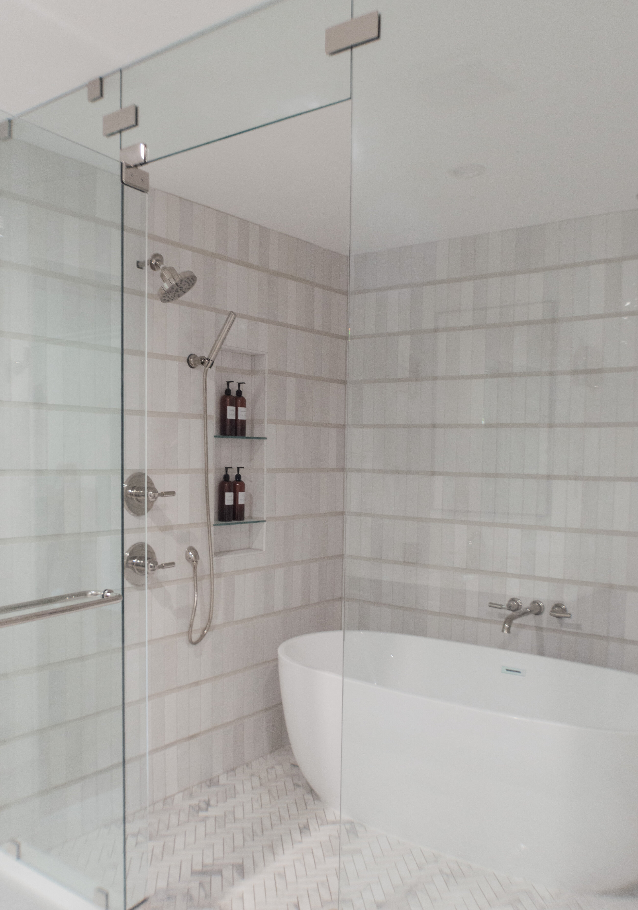
AFTER (Combining the tub and shower area saves space and creates drama)
laundry room

BEFORE (This space was divided to create a pass through Laundry from the Garage and the new Owner’s Bath on the side not shown)

AFTER (We brought the same green from the front door into the Laundry to maintain some consistency)
pool bath

BEFORE (The layout of the bathroom works so we made only aesthetic changes)

AFTER (Completely updated everything for a bright and clean look)
playroom bath

BEFORE (The layout of this bathroom was also fine as is)

AFTER (We went with an emerald vanity for a little more drama and fun since this bathroom is off the Playroom)

AFTER (We wanted the vanity to be the star so we went with a black and white color scheme for the rest of the finishes)
THAT’S ALL FOLKS!
Thanks so much for checking out this Before and After tour of our Morgan St. Renovation. I can’t wait to show you the second phase of this house fully accessorized with professional photos! We made sure to leave out some spaces so we’ll have some never seen before shots too! Stay tuned :)
xK
P.s. If you or anyone you know are looking for an Interior Designer in Orlando, FL, don’t hesitate to contact us for a free interior design consultation!